top of page

Create a simplified, action driven home experience
When I first started, the Home screen had too much going on. Attention was fragmented, the layout needed prioritization to improve engagement, and discoverability was lacking for retention driving experiences.
HMSwingU improve feature visibility, increase trial to paid conversions, and reduce noise to simplify the experience and drive successful completion of our target behaviors?
After applying my behavior design process, two rounds of user testing, and executive feedback, we landed on a dynamic design to capture all states for each user type (new, existing, free, paid).
The refreshed home screen delivered a cleaner, more intuitive experience that helped users quickly access key features and take action faster.
We saw engagement skyrocket for under utilized features – 125% adding club to Golf Bag, 100% utility of the new primary cta, and 82% D7 retention.
Previous Designs
TV pulled focus from upgrade content card
New Free User

Zero state empty containers that confused new users
Outdated hamburger menu on tab bar
New Paid User

Primary cta only shown for paid users
Design had little white space to focus the users attention
Existing Free User
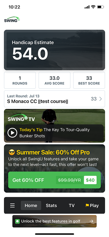
Handicap estimate held lots of real estate
Existing Paid User

Practice priority was not a user priority
-1.png)
Design Evolutions
I used the BJ Fogg Behavioral Model (B=MAP formula) to design different solutions to achieve our business goals and create a better experience for all users.
Below are some of my design decisions:
-
Add primary cta to the free user design to prioritize our main behavior
-
Grouped Play flag icon with the handicap estimate instruction to connect the behavior (play a round) with the result (handicap estimate)
-
Removed hamburger icon and all actions within it from navigation
-
Search a course, Clubhouse, and Golf Bag were all given visibility
-
Created a new Profile to house all account settings and remaining features previously in the menu
New Free User
Mid-fidelity

Removed tv to give upgrade content card prime real estate
Hi-fidelity

Concept to remove ads for D1-7
Final UI

Created golfer icon to increase mental model between physical act of playing with the digital app experience
Existing Paid User
Mid-fidelity

Removed tv to give upgrade content card prime real estate
Hi-fidelity

Removed tv to give upgrade content card prime real estate
Final UI

New handicap estimate color to seed primary action with results
Additional design concepts to explore future states with Social initiative features that were in strategic development.

Final Designs
Upgrade content card immediately draws the eye
New Free User
First impression of product is focused on the main behavior and what the user will receive after completion
Immediate visibility and access to Clubhouse and Golf Bag
Streamlined navigation in compliance with liquid glass
New Paid User

Future state will repurpose TV tip with feature cards to drive user engagement through visibility
Stats only show if the user has saved a round to their account
Existing Free User

During user testing, our initial hypothesis to remove Last Round was proven incorrect. We added it back into the final designs.
Existing Paid User
Only users who enter Strokes Gained scores during their rounds will see additional stats to review
Previous User Profile

Previous Hamburger Menu

Free User Profile

Highlighting the users profile information to prepare for future Social initiative
Consistent design across both user types to create a pattern that follows users who upgrade
Secondary ctas for additional actions
Paid User Profile

Results
We spent 3 months refining and creating a lean strategy and design that would accomplish our Product & Design goals. After testing with power users, we learned where we had been incorrect (last round importance) and what we got right (simplicity of design).
Some notable wins include,
-
+100% "Start A Round" primary cta selection release over release
-
+125% club additions, +70% club edits, +64% club views on Golf Bag
-
+23% create an account to course explore
-
+9% create an account to round started
-
+12.1% D1 & +82% D7 retention rates
After our first large project as a new team, we learned how to improve our collaborative process, create requirements that suite a lean approach for faster execution, and created a user research process that helped strengthen stakeholder feedback in the success of our solutions.
bottom of page