top of page

Showcasing the value of the premium experience
When a new user downloaded the app and created an account, they were hit with an immediate paywall to upgrade. We were withholding the value of the premium experience while asking them to invest more.
Conversely, users that had upgraded (trial or subscription) weren't engaging with the personalization features that help inform and improve their paid experience. Users were skipping steps and missing out on high value features.
HMSwingU entice users to upgrade out of the box & improve day 1-7 retention after upgrading?
Our strategies were lean for both designs; Purchasely Flows was used for new users, to design and implement a previous pattern in our design system and the post upgrade experience was modernized to improve ability, motivation, and successful completion of the entire flow.
We blew our goal out of the water! User completion increased from 15% to 58% completion rate and our trial to paid conversions had a 6.6% increase.
1. New User Onboarding
I repurposed the paywall design inside of the GPS flow for quick execution.


-1.png)
Final Designs for New User Onboarding Flow
We scaled the number of features down to the 5 most important, removed excessive copy, and added the new brand colors to draw the users attention.
An unexpected lift from our new onboarding feature showcase was to monthly subscriptions with +81% and we increased revenue by 10% over the control.

2. Post Upgrade Onboarding
The existing flow allowed users to skip completion, which removed value for the new benefits available post upgrade. It also emphasized Strokes Gained details, a feature users have expressed a lack of knowledge or use for in NPS surveys.

To ensure we stayed lean in our approach and execution, I mapped out the flow, finalized the experience, and added visual polish before testing our proposed solution with Android and iOS users.

User Feedback
We conducted two tests with free users on iOS & Android who have saved two or more scorecards in the last 7 days. Participants interacted with a clickable Figma prototype on the user testing tool, Maze.
Comprehension rates were strong but users still wanted to understand why we were requesting answers for both questions specifically. To address their concern, I added a single line of copy below each question finalized our solution we now had full confidence in.
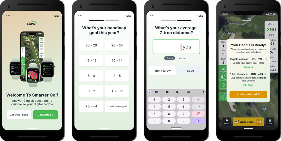
Android participants


iOS participants


Results

The BJ Fogg Behavior Model (B=MAP formula) proved successful again, giving the team confidence in my UX strategy and process.
Some notable wins include,
-
+58% completion (both questions answered)
-
+6.6% pp Trial to Paid conversion
-
+2% engagement increase for Golf Bag and TV features
bottom of page